Have you ever visited a website, spent some time on it, and then suddenly wanted to get to a specific page/complete a task but were completely lost and didn’t know where to go? I have.
A great design will be useless if users have to search for everything on the site. You have about 30 seconds to capture the attention of a user.
Website navigation is the single most important aspect of any application or interface because it is associated with many things, such as accessibility, etc.
Users must be able to easily navigate through, rather than getting lost in the numerous pages on the website, which happens most of the time. One of the elements that improve the user experience is navigation. This article will discuss five UX tips for improving your site’s navigation.
Here are the following 5 UX Tips for Designing an Ideal Website Navigation:
1. Make the logo visible:
A NJ web design company’s logo serves as its digital face. It represents them not only on their website but also on other platforms such as online forums, social media, email signatures, etc.
As a result, the logo is crucial in establishing brand recognition, trust, and loyalty. To maximize the logo’s brand-building potential, it must be properly placed, sized, and spaced in the website’s header. Such as:
- Link: Connect the logo to the Home page.
- Positioning: Place it in the top-left corner (according to research from NNG). If you want to put it in the center, make sure there is a Home link in the left corner.
Size: Make sure that every detail is visible and easy to read. The ideal sizes for rectangular logos are 250px x 100px and 160px x 160px for square ones, though it all depends on how much breathing room you want to give your navigation links.
For example, the dentist 4 logo is 166px x 60px:
Making the logo any larger without increasing the header’s font size would create too much space around the navigation. As a result, it’s a balancing act. If you go with a larger logo, make sure it doesn’t take up so much space that your links get lost.
2. Use White Spaces, Color Combinations, and Visuals Wisely:
Use white spaces with care, as they can make or break the appearance of your UX design. While spaces are the empty areas on your website navigation. Blank spaces do not have to be white; they can be any color, depending on the color scheme of your website. You should make good use of these blank spaces to improve readability.
Making use of blank space in the right and left margins, as well as between paragraphs, can help viewers scan your content more easily. This, in turn, makes it easier for them to learn about your call-to-actions (CTAs).
Let’s get into the visuals now.
- When compared to text, visuals are more appealing to users. If the visuals are appealing enough, any visuals, such as photos, videos, gifs, and so on, can quickly entice customers.
- Including these visuals on your website and making them clickable with links helps drive traffic to specific pages and make your website easier for users to navigate.
Now it’s time to experiment with colors.
- If you’re unsure what you’re doing, experimenting with colors on your website can be difficult. To avoid overwhelming or underwhelming your website’s visitors, colors should be used cautiously.
- Colors can help set the tone and atmosphere of your site, but using too many can be overwhelming.
- Stick to a few key colors that complement one another and help to create the mood you want for your website.
Furthermore, colors can help you distinguish between different types of content on a website. We recommend selecting one color that will dominate your web pages to establish a theme. Lighter colors can be used for blocks such as the search box.
3. Make the best use of your footer
A footer is typically the last section of a website that shares important information such as a physical address, contact information, and social media links. Footers must be consistent across the site.
You can include important links in the footer. The footer also contains an email sign-up form, payment logos, and other information. If necessary, include a concrete footer.
4. Increasing their visibility to the end user
- Breadcrumbs are a type of website navigation aid that helps people find their way around a website. This type of orientation is especially important if visitors are directed to deeper pages on the site from outside sources.
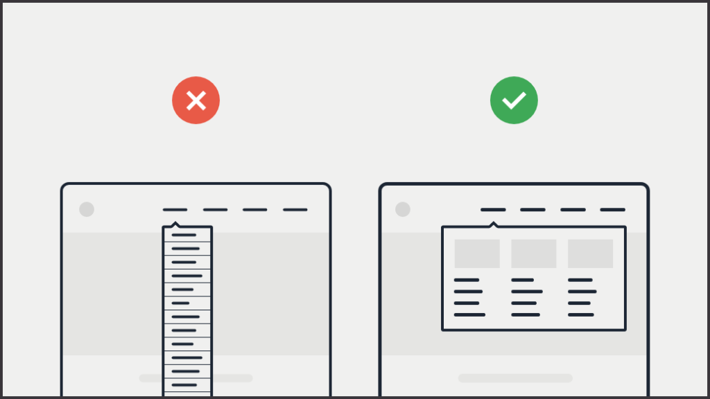
- On large screens, avoid using tiny menus (or menu icons). They should not be hidden when there is enough space to display the menus.
- Always try to place menus in familiar places. The majority of the time, users spend their time on other websites. As a result, users expect to see UI elements they’ve seen before on other apps or sites (e.g., top of the screen, left rail).
- Make the menu links appear interactive. If the options do not appear clickable, users may not even realize they are in a menu (or tappable). If you use too many graphics or strictly adhere to flat design principles, menus may appear to be just decorative pictures or headings.
- Make sure your menus have enough visual heft. Menus in familiar locations don’t always require much surrounding white space or color saturation to stand out.
- Use contrast colors for link text and background color. It’s incredible how many NJ website designers disregard contrast guidelines; navigating digital space is disorienting enough without squinting at the screen just to read the menu.

5. Always Follow User Conventions
Your website navigation is not the place to differentiate your brand. The best option is to stick to the conventions that your visitors are already accustomed to, such as:
- Keeping the main menu horizontal and near the top of the page.
- Adding a link to the home page in the top right corner of every page.
- Making the menu stand out from the background by using contrasting colors.
The more consistent you are, the easier navigation will be for visitors accustomed to how most websites operate.

Conclusion
UX means ensuring visitors have the best possible experience when visiting your website. That entails optimizing your navigation with your intended audience in mind. For example, effective menus can mean the difference between a bounce and a conversion, especially as more users browse your site on mobile devices.
We attempted to compile a list of UX tips for improving website navigation. These suggestions are critical for a better user experience. You cannot afford to have a difficult-to-navigate website as a website owner. The suggestions above will assist you in developing user-friendly navigation for your website.